WordPress 6.7 is set to roll out on November 12, 2024, and it’s absolutely packed with exciting new features and capabilities. I’ve been digging into it in Playground, and I have to say—there’s a lot to love here.
With additions like the Zoom Out mode for big-picture editing, a streamlined custom font library, and better support for dynamic content, WordPress 6.7 is all about making site-building inside FSE more powerful and intuitive.
One thing missing in the final build, however, was Content Model which is a new core feature that brings custom post types to WordPress. Most people – including myself – expected it to appear inside 6.7, but it is still filed under experimental right now.
TL;DR: What’s New in WordPress 6.7?
⚙️
Performance Boosts – Faster load times and improved responsiveness.
🎨
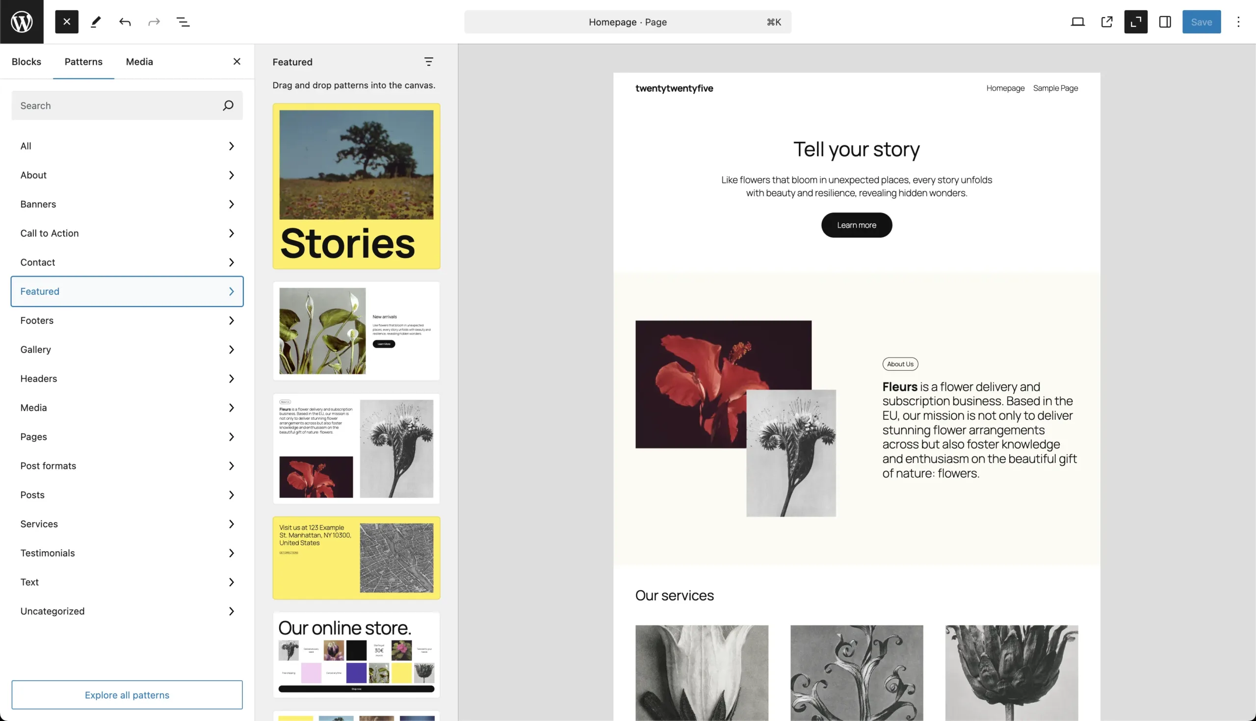
New Default Theme – Twenty Twenty-Five brings a pattern-based design, ideal for easy, stylish site building.
🔍
Zoom Out Mode – Edit at the pattern level for streamlined layout management and faster workflows.
📸
Media Improvements – Enhanced support for HEIC/HEIF formats, lazy loading, background images, and lightbox functionality in galleries.
🛠️
Expanded Block Customization – More block options for borders, colors, and shadows.
🖋️
Font Library – Centralized font management and fluid typography for automatic scaling across devices.
Let’s dive into the standout features and see how they can simplify your workflow, level up your design, and give you even more creative control.
New Default Theme: Twenty Twenty-Five

With WordPress 6.7, Twenty Twenty-Five arrives as the new default theme, bringing a fresh approach focused on pattern-based design.
This theme makes building stylish sites easy by providing pre-designed patterns and styles you can apply and customize quickly.

Whether you’re building a blog, portfolio, or small business website, you’ll have a polished look right out of the box—no advanced design skills needed.
Why it matters: Twenty Twenty-Five is ideal for creators who want a visually cohesive site without spending too much time on design. You can choose a pattern that fits your brand, tweak it to match your style, and go live faster.
Zoom Out Mode
One of the most talked-about features in WordPress 6.7 is Zoom Out mode. And when you see it in action, you’ll wonder how you ever lived without it.
With a single click, you can switch to an overhead view of your entire page layout, making it easy to see the design as a whole rather than working block by block.

This perspective helps you maintain a cohesive design across sections and provides a dynamic way to rearrange and experiment with different patterns.
If you’re designing complex, long pages and custom blog post templates, having the ability to take a bird’s eye view of the entire page (without using the command + – key combo) is brilliant.
In Zoom Out mode, you can:
- Add and Rearrange Patterns: Place patterns into your design directly from this view, allowing for faster adjustments across larger sections.
- List View Adaptation: When you switch to Zoom Out, List View shows patterns instead of individual blocks, reducing visual clutter and keeping the workspace clean.
Why it matters: This mode saves you time and improves layout consistency by letting you adjust your entire page’s design at once. It’s perfect for site builders creating multi-page websites or complex layouts who need an easy way to manage and visualize big-picture designs.
Section Styles: Flexible Client Control
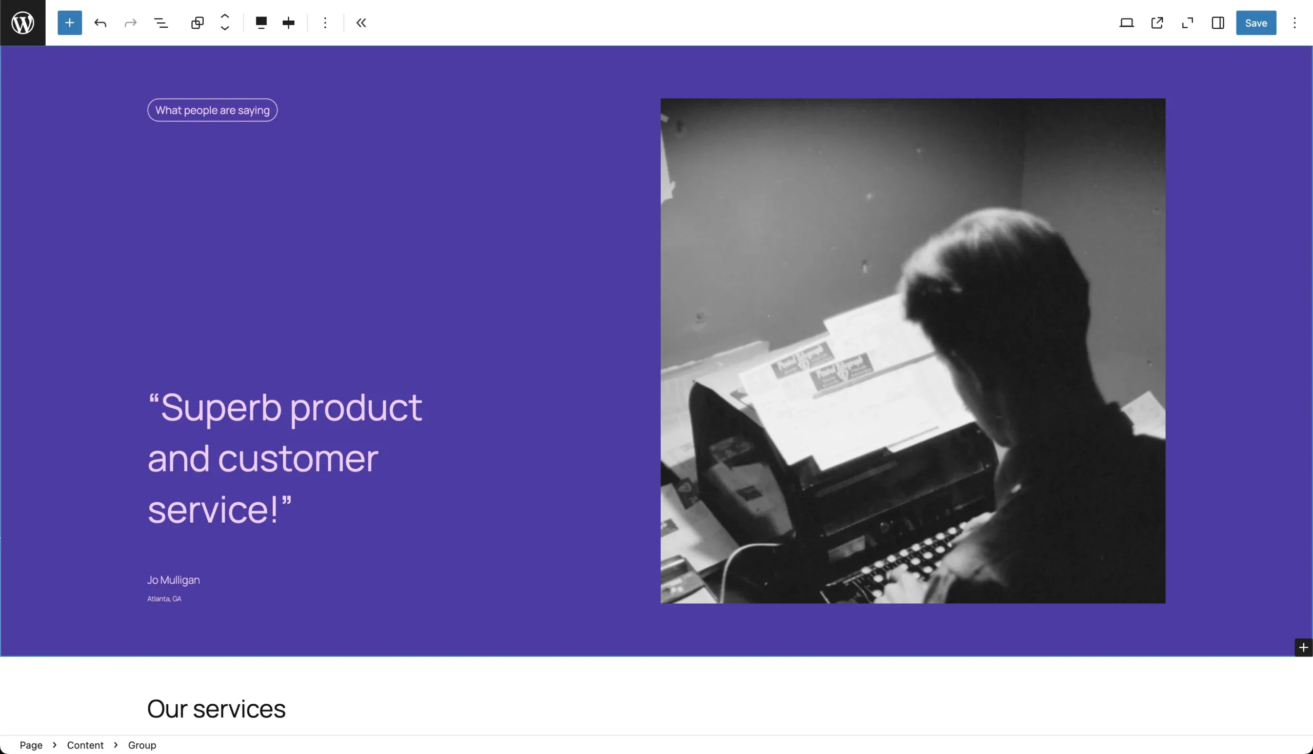
WordPress 6.7 introduces Section Styles, a powerful tool that lets you style different parts of a page independently.
This means that you can apply unique colors, backgrounds, font choices, and other styling options to specific sections—such as headers, footers, call-to-action areas, or any custom content section.
With Section Styles, each part of a page can have its own look, making it easier to achieve a distinct, polished appearance without affecting the entire site.
Why Section Styles Matter
For designers and developers, Section Styles provide greater creative freedom. You can style each section to match its function and importance on the page, such as:
- Headers and Footers: Apply contrasting colors or bold typography to make headers stand out or give footers a distinct look that doesn’t interfere with the main content.
- Call-to-Action (CTA) Sections: Highlight key areas like CTA buttons by giving these sections vibrant colors or unique backgrounds, helping them attract visitor attention.
- Featured Content Areas: Style important content sections differently to make them more engaging and visually distinct from the rest of the page.
- Protecting Brand Consistency: You can lock in design elements that are essential to the brand—such as colors, fonts, and logos—so clients can’t unintentionally change them.
- Controlled Flexibility: If a client wants to experiment with minor adjustments (like background colors or border styles) in certain sections, Section Styles make it easy for them to do so without affecting the rest of the page’s design.

Section Styles are a powerful way to provide instant customization to your WordPress pattern designs. Speaking of pattern designs, the Ollie Pro pattern library has hundreds of responsive, pixel-perfect patterns that are ready to save you dozens of hours of design time on your next project.
Why it matters: Section Styles provide a balance between customization and consistency. For designers managing client sites, this feature allows you to maintain brand integrity while giving clients limited control, ensuring a cohesive look across the site without compromising visual identity.
Performance Enhancements
WordPress 6.7 introduces several targeted optimizations designed to make sites load faster, respond more smoothly, and perform efficiently across the board.
These updates not only improve user experience but also contribute to better SEO, as faster, optimized sites tend to rank higher on search engines. Here’s a list of the top performance enhancements.
- Query Optimization & Query Loop Block Enhancements
- Core Performance Enhancements (PHP 8.x Compatibility, Script Loader Enhancements)
- API Improvements (Interactivity API Enhancements, Preview Options API)
These performance enhancements in WordPress 6.7 are especially impactful for high-traffic websites, content-heavy platforms, and sites with intricate layouts or numerous media elements.
By optimizing media handling, query performance, and the core interface, WordPress 6.7 delivers a faster, more seamless experience for users and site owners alike.
Why it matters: Faster load times are critical for SEO and user retention. With 6.7’s performance enhancements, your site can load quickly and deliver a seamless experience across all devices.
Wrapping Up
WordPress 6.7 is a major release focused on elevating both user and developer experiences. Packed with performance optimizations, flexible design tools, and streamlined editing features, it’s a powerful update for anyone creating or managing a WordPress site.
With Zoom Out Mode, editing complex pages becomes faster and more intuitive. The Query Loop Block enhancements make it easy to display dynamic content with new filtering and sorting options, ideal for content-heavy sites.
Performance improvements like PHP 8.x compatibility, optimized script loading, and enhanced database queries boost load times and responsiveness, giving visitors a smoother experience and helping your SEO.
For designers, Section Styles, fluid typography, and the Font Library provide refined control over page layouts and brand consistency. The Custom Field UI and Interactivity API updates streamline workflows for sites that rely on dynamic data and interactive elements.
And if you’re just getting started with WordPress, make sure you A) check out our detailed guide on getting started with Full Site Editing in WordPress, and B) how Ollie Pro can help you quickly design pro-level sites in record time.


Leave a Reply