Getting Up To Speed With Block Design
WordPress Full Site Editing (FSE) Basics
Learn the basics of Full Site Editing, from how to get started to understanding templates, styles, and patterns
Full Site Editing (FSE) in WordPress makes it easier than ever to build and customize your entire website—all without needing extra page builder plugins. With FSE, WordPress gives you everything you need right in its core editor, so you can design every part of your site in one place.
In this guide, we’ll walk you through the basics of Full Site Editing.
You’ll learn how to get started, work with templates, customize styles, and use patterns to make your site look just the way you want.
Let’s get into it!
The Beginner’s Guide To Full Site Editing In WordPress
Full Site Editing Basics: What You Need To Know
Full Site Editing (FSE) in WordPress completely changes how you build and customize your website by integrating a flexible, block-based experience (rather than the rigid Classic Editor of old).
Instead of relying on separate page builders, FSE gives you direct access to powerful tools within WordPress, so you can design, structure, and manage your site’s entire look and functionality.
1. Getting Started with Full Site Editing
To get started with Full Site Editing, you need a block theme like Ollie, which unlocks all FSE features and sets up the framework for customizing each part of your site.
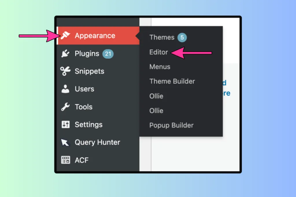
- Install a Block Theme: Download and activate Ollie or another block theme to access FSE.
- Access the Site Editor:
- Go to the Editor option under Appearance in your WordPress dashboard, or click Edit Site from the top bar on the front end of your site.
- This editor serves as your workspace, allowing you to adjust your website’s appearance and structure all in one place.
- The Site Editor provides a live preview and editing tools, making it easy to change designs in real time.
2. Exploring the Site Editor Interface
The Site Editor centralizes essential WordPress functions, giving you quick access to everything from page creation to template adjustments in a single, streamlined interface.
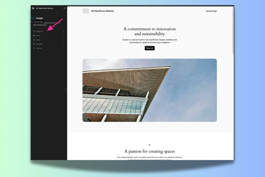
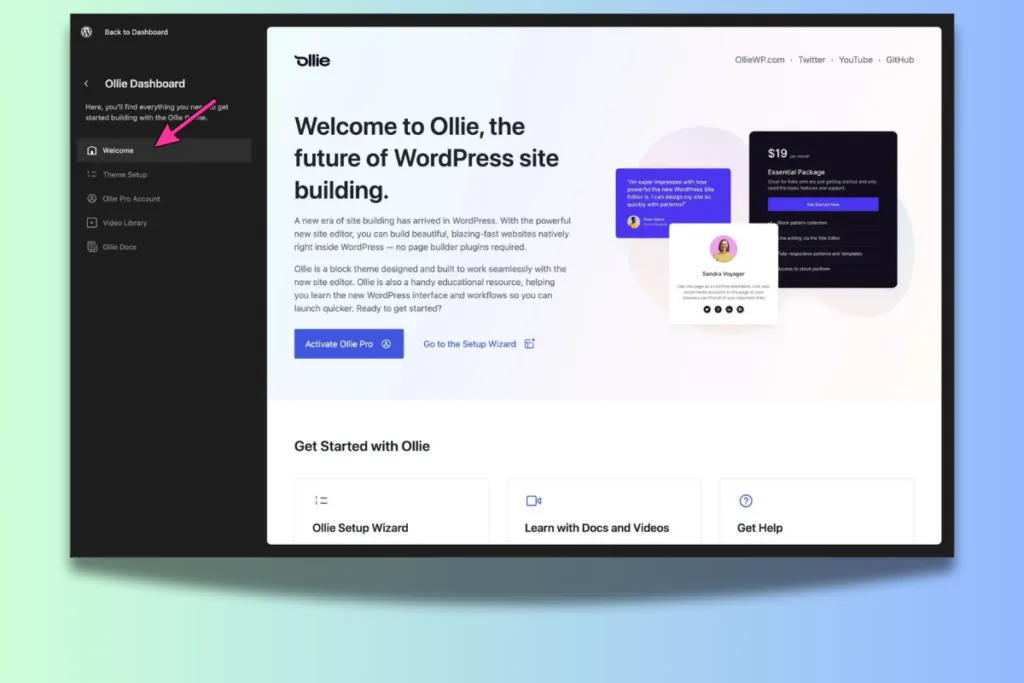
Key areas include:
- Page and Content Editing: Access and edit pages and posts without leaving the editor.
- Template Management: Modify the structure of your templates, including headers, footers, and layout elements.
- Global Styles: Adjust typography, colors, and layouts for your entire site or for individual blocks.
This cohesive experience eliminates the traditional divide between the back-end and front-end, making site management smoother and more efficient.
3. Navigating the Sidebar
The Navigation Sidebar on the left of the Site Editor preview serves as the control center for your site’s structure and content.
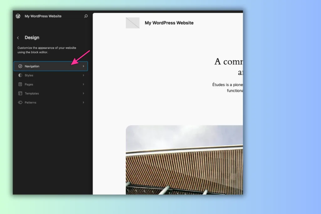
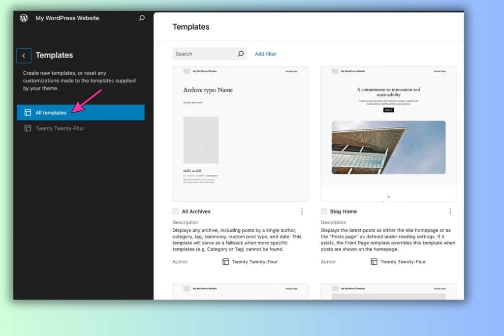
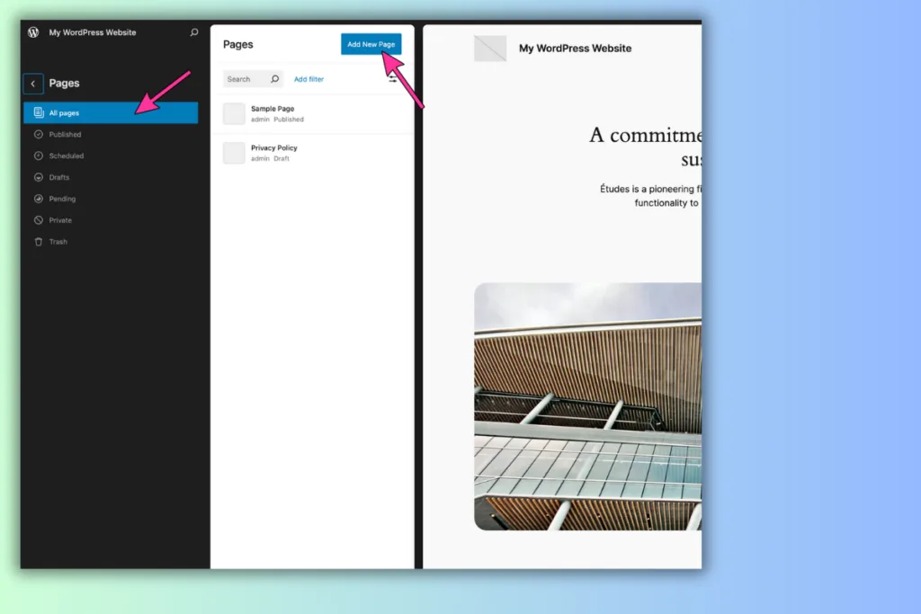
Here’s what you can do from this sidebar:
- Preview Your Site: See live previews of your pages as you design.
- Manage Menus: Access and edit your site’s navigation menus, such as the primary menu displayed in the header.
- Organize Templates and Template Parts: Quickly access and edit templates or template parts like headers and footers.
- Adjust Available Tools: The sidebar changes based on your theme and page settings, showing only the tools relevant to your configuration. Open the Options menu (three dots) to rearrange, add, or remove elements.
4. Navigation: Customizing Menus and Site Structure
The Navigation feature in FSE enables you to control your site’s menus more intuitively.
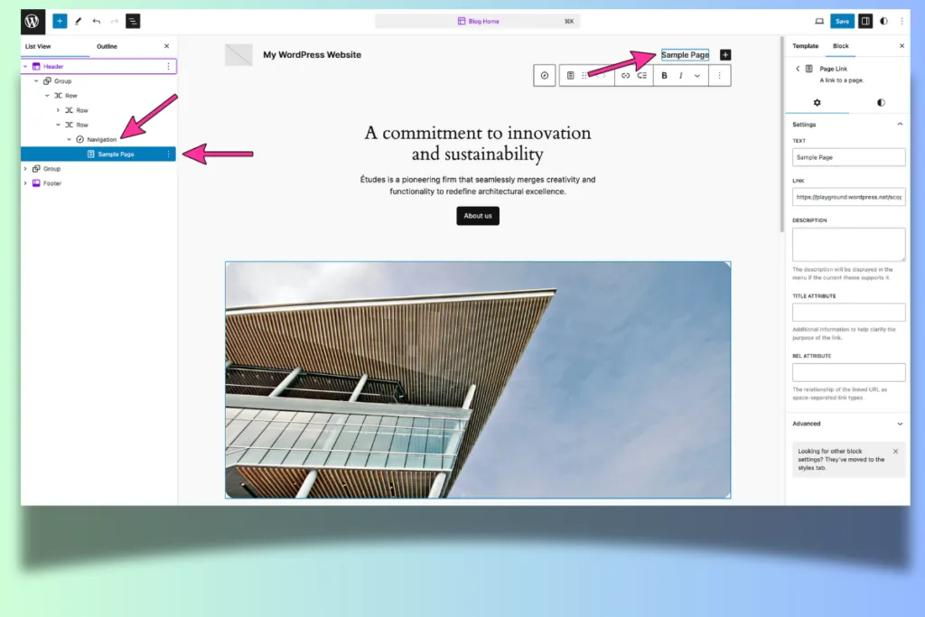
One of my main gripes with WordPress right now relates to the navigation menu – it’s just a bit too basic.
You can code up more extravagant menus with code and page builders, these are often called Mega Menus, but getting them to play ball on mobile is pain in the butt.
For this reason, and for making your site easier to crawl, your best bet is to go with a simple main navigation menu with drop-downs, when appropriate, that signpost all your most important pages and categories.
Site Structure & Navigation Basic Settings
- Adding New Pages: Quickly add pages to your menu and organize the structure.
- Drag and Drop Rearrangement: Adjust menu items by dragging them, making it simple to reorder and customize your site’s navigation.
- Detailed Menu Item Controls: Each menu block includes a settings menu, allowing for options such as move, remove, and block-specific styling.
This approach to navigation is directly tied to your site’s layout and ensures consistency across headers, footers, and other areas.
5. Styles and Global Adjustments
The Styles panel in the Site Editor allows for site-wide customization that matches your brand.
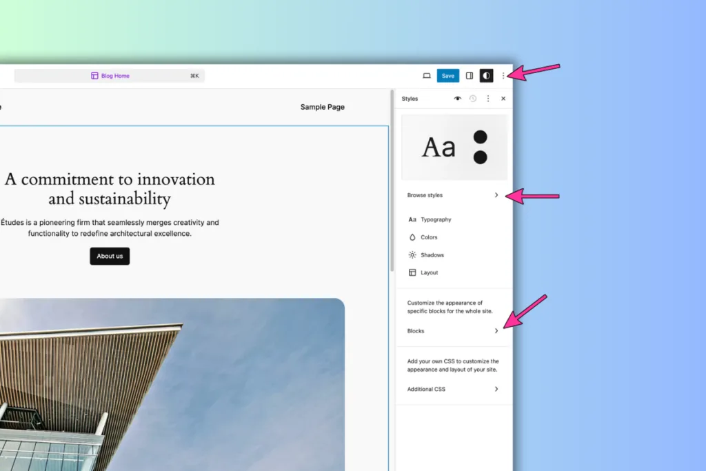
The global style settings in the Styles panel enable you to create a unified, cohesive look across your entire website.
By adjusting options like typography, colors, shadows, and layout, you ensure that your design choices are consistent throughout every page and post.
Any changes you make in this panel are applied site-wide, so updates to fonts, color schemes, and layout settings instantly reflect across your content.
This functionality allows you to establish a strong, branded visual identity that remains uniform as you add new pages or posts, helping to create a seamless experience for your visitors.
- Style Variations: Switch quickly between your theme’s preset styles, such as different color palettes, typography, and background options.
- Advanced Customization: Access options for typography, colors, and layout adjustments. For example:
- Select a site-wide font and choose default font sizes.
- Set background colors and apply consistent layout spacing.
- Detailed Control via Styles Sidebar: Use nested panels in the Styles Sidebar for fine-tuning both default and block-specific settings, enabling precise customization for individual blocks or groups.
6. Pages and Template Editing
With Full Site Editing (FSE), Pages and Templates work together to give you precise control over both the content and the overall structure of your site.
This means you’re not just adjusting individual pages; you’re shaping how different types of content are displayed across your entire website, making it both flexible and efficient.
Pages allow you to focus on the specific content you want to present, like text, images, or videos on a single page or post.
You can create and customize these elements directly in the editor, ensuring each page is unique and suited to its purpose.
For instance, if you’re creating an “About Us” page, you might add your story, team photos, and contact information.
Templates, on the other hand, define the layout and structure for different types of content across your site.

Think of a template as a reusable design that you can apply to multiple pages with similar structures, like blog posts, category pages, or product listings.
Instead of designing each new post from scratch, you can set up a template with a header, featured image section, content area, and footer.
Every new blog post you create will automatically follow this layout, keeping your site visually consistent without extra effort.
For example, if you want all blog posts to have a specific layout—say, with the title and featured image at the top, followed by the post content—you can create a template for your blog posts that applies this structure.
Now, every time you write a new blog post, it will automatically use this design, saving you time and ensuring consistency.
If you decide to tweak the layout (like moving the featured image above the title), you only need to update the template, and every blog post on your site will reflect this change instantly.
By using Pages for unique content and Templates for consistent layouts, FSE gives you the flexibility to build each page’s content while keeping the overall site structure organized and easy to manage.
This combination of customization and consistency makes your site look polished and professional, all while reducing the time you spend on repetitive design tasks.
Here’s How It’s Done
- Edit Page Content: Adjust text, images, and other elements on any page directly within the Site Editor.
- Template Editing:
- Switch to template mode to modify the layout or design of the template that controls a page’s structure (e.g., relocating a featured image).
- This lets you change design aspects without affecting the content itself.
This dual capability makes it easy to customize individual pages or apply changes across multiple pages for a consistent look.
You can also transform your category pages into valuable resource hubs, making them more visually engaging and useful for readers.
You have two options: you can update all of your Archive pages in FSE to enhance their appeal and functionality, or you can create custom Archive pages tailored to each category, adding unique elements that suit the specific content.
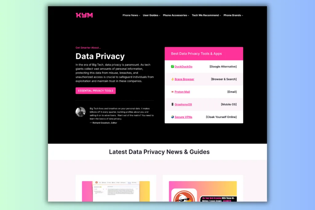
For instance, you could include targeted calls-to-action (CTAs) and lead magnets on each category page.
If you have a category focused on electric car maintenance, you could place a CTA for a downloadable resource at the top of the category page.
This would allow you to collect emails over time, turning your category page into a powerful lead-generation tool.
7. Templates: Designing Site Layouts
Templates in FSE define the layout of specific sections across your site, including blog archives, individual posts, or 404 error pages.
You can have as many or as few as you like. If you run a site that covers a lot of different topics and has a few distinct types of content – affiliate posts, news posts, and user guides posts – you can create distinct post templates for each.
Without FSE, this would require coding know-how or a page builder like Elementor. With FSE, you can do it all inside WordPress which means less additional code and scripts running on your site and faster loading times.
You can get as complex as you like with post and page types, customizing and tweaking them as much as you like.
And the beauty of FSE is that you can tweak and test as you go. If you analytics and engagement tools like Microsoft’s Clarity, you can see how users interact with your page.
The flexibility and ease of deployment FSE gives you means you can A/B test designs. For instance, you could create a new page template, add the content, and then put it live.
Next, you’d duplicate the template (you can use Admin and Site Enhancements (ASE) for this; it is brilliant) and then make some slight changes to it – move the CTA higher, change the copy slightly. Whatever.
Now you have two designs to compare. Let the pages index and generate some traffic, then compare how the designs did in terms of engagement with Clarity.
Basic FSE Templates
- Index Template: Used for blog listings.
- Single Post Template: Controls the layout of individual blog posts.
- Page Template: Controls the layout and look of your site’s pages. You can set up pages to be Full Width too, with no header section. This is great for landing pages and pillar posts.
Editing Templates:
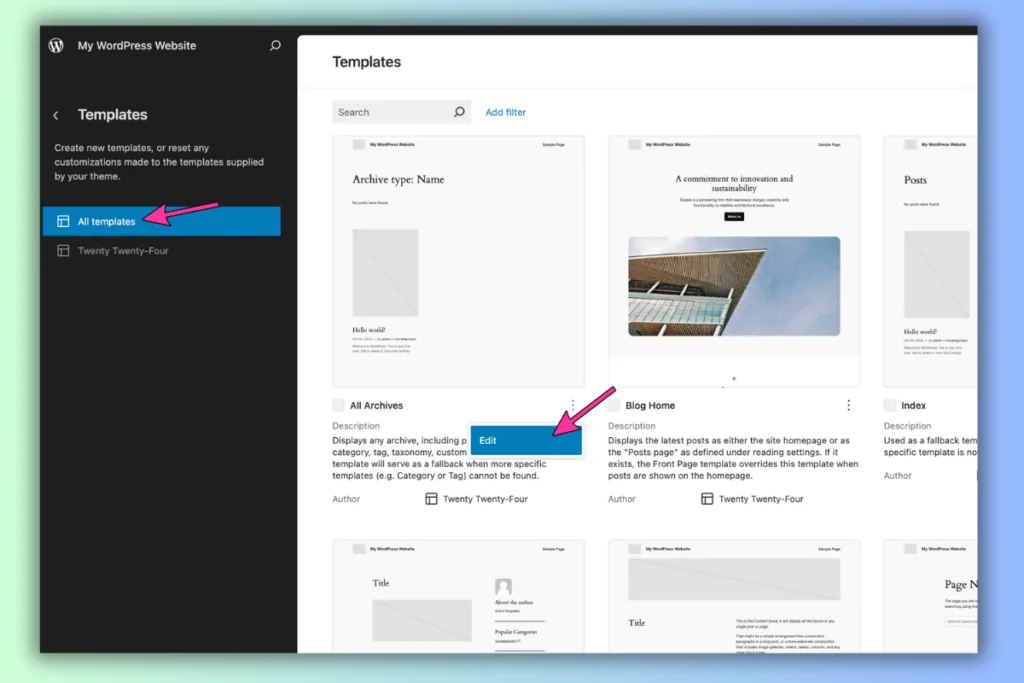
- Click on a template, make adjustments to layout, positioning, and styles, and save.
- Changes to templates apply universally across all associated pages, ensuring uniformity.
Managing Templates
The Template Sidebar provides additional options for managing and creating new templates.
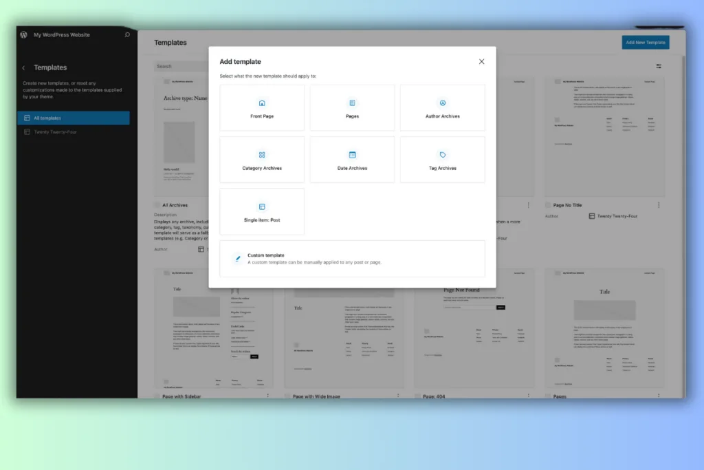
- Add New Templates: Use the plus icon to create new custom templates.
- Manage All Templates: The “Manage all templates” option opens a detailed screen where you can:
- View which templates are active, customized, or unused.
- Rename, delete, or restore templates to their default configurations.
8. Patterns: Building with Pre-Designed Elements
Patterns are pre-designed block collections that make it easy to create consistent design elements across your site.
You can create and save patterns for use later. You can sync them, so the information remains the same, or leave them open so they can be edited each and every time you use them.
For instance, you could create a TL;DR element that gives a summary of your post’s content at the top of the article.
Instead of doing this every single time manually, instead you’d do it once, save it as a pattern, and then simply add as and when you need it.
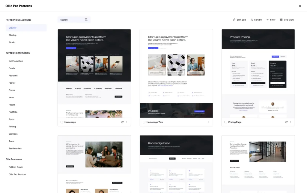
Patterns come in all shapes and sizes. They can serve myriad purposes too, from adding some flair to a piece of content to collecting email addresses or getting user to click on something.
The sky’s the limit, and setting them up is super-simple. Once you start experimenting with patterns in your posts and pages, you’ll wonder how you ever lived without them.
Basic Patterns In FSE
- Card Patterns: Compact designs ideal for smaller spaces and columns.
- Full-Width Patterns: Suitable for headers, footers, and larger page sections.
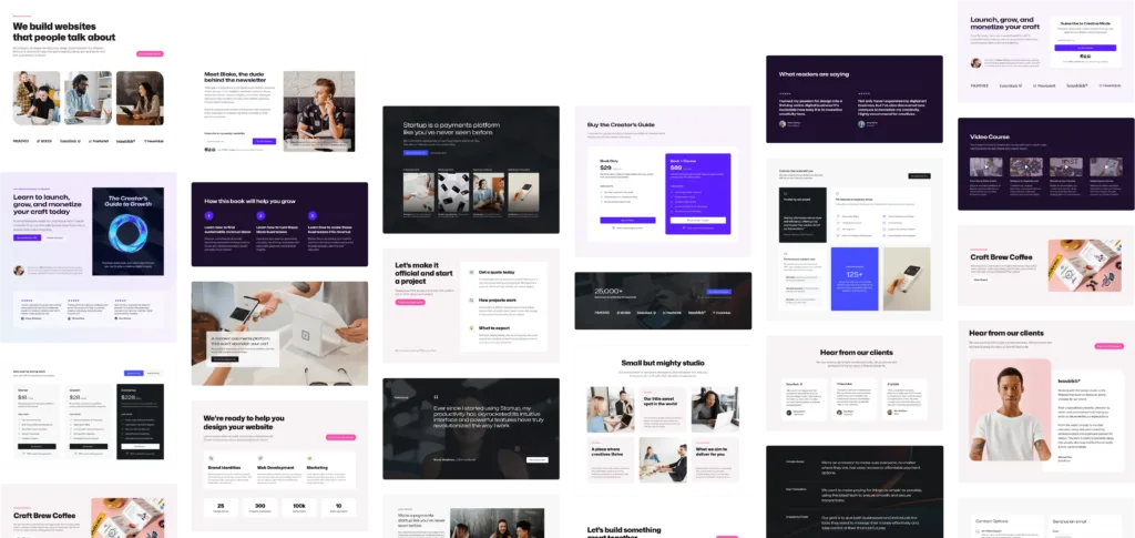
Patterns speed up the design process, and Ollie includes over 50 patterns for various uses, categorized into styles such as calls-to-action, pricing tables, and headers.
You can insert and customize patterns with one click, saving you time and maintaining a consistent look across your entire site.
9. Advanced Site Editor Features
The Site Editor includes many features for managing site-wide and block-specific styles.
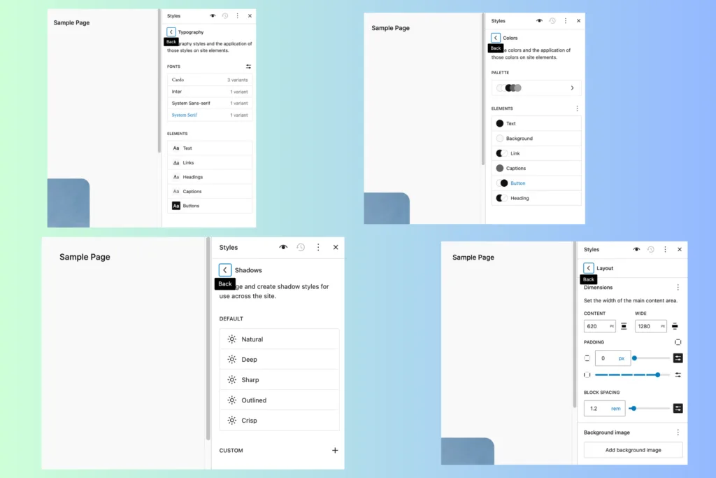
Instead of adjusting design elements page by page, you can make global changes that automatically apply to every part of your site, giving it a professional and cohesive feel.
This is particularly helpful for beginners because it means you only need to set things up once, and your entire site will reflect those design choices.
For example, if you choose a specific font for headings in the Typography panel, that font will automatically apply to all headings on every page and post.
You won’t have to update each one individually, which saves time and ensures that every part of your site looks consistent.
Imagine using a bold, modern font for your headings and a clean, easy-to-read font for body text. With global typography settings, these choices carry across your whole site, making your content look organized and professional.
The Colors panel offers similar benefits. Let’s say you choose a color scheme that aligns with your brand, like blue for primary buttons and gray for background elements.
By setting these colors globally, every button and background on your site will follow that scheme, creating a consistent visual experience for visitors.
If you later decide to change your primary button color, you can simply adjust it in the Colors panel, and it will update across all pages instantly—no need to go through each button one by one.
The Shadows and Layout panels allow you to add finishing touches that make your site look polished. For example, adding a subtle shadow to images or boxes can make them stand out, giving your pages a bit of depth.
You might apply a “Natural” shadow style to images to give them a professional feel without overpowering the design. Layout settings let you control the spacing between blocks and the width of the content area.
If you want your site to feel open and spacious, you could set wider padding around elements and a larger content width.
These adjustments are applied site-wide, so every page maintains the same layout structure, making navigation more intuitive for visitors.
By mastering these advanced global styling tools, you can ensure that your site has a cohesive, user-friendly design that reflects your brand’s identity, all while saving yourself from making repetitive changes on each page.
This approach not only creates a consistent experience for your audience but also simplifies the design process, giving you more time to focus on creating great content.
Basic FSE Styles Settings
- Browse Styles: Choose from preset theme style variations to quickly update the look and feel of your site.
- Default Block Styles: Customize typography, colors, and spacing for each block type.
- Reset Styles: If needed, reset styles back to theme defaults through the Styles Actions menu.
- Custom CSS: Add custom CSS directly to specific blocks or across your site from within the Styles Sidebar.
- Style Book View: Preview all block types to see how your style changes affect each component.
Why Full Site Editing is the Future
OK, that was a long post and we covered quite a lot of ground but realistically we’ve only scraped the surface of what’s possible with design and customization in FSE.
This guide is aimed at giving you a high-level overview of the basics of FSE, how to get started – think of it as a jumping-off point.
If you’re a complete beginner, FSE might seem a little daunting at first. But keep in mind that what you’ve just read is basically all you need to know to get started.
And if you want to test FSE out before you go live with on your site, checkout the WordPress Playground – you can mess around with FSE in your browser.
All the images in this post were created using WordPress Playground too. It gives you a blanc WordPress to mess around with and it is a great way of learning your way around FSE.
But the main takeaway is simple:
Full Site Editing represents a significant shift in how WordPress users approach site design, offering lightweight, integrated tools that enhance flexibility, speed, and usability.
So, to recap: here’s how FSE in WordPress makes life A LOT easier for site owners:
- Unified Customization: Modify every site element from a single interface.
- Enhanced Performance: Native, core functionality reduces reliance on third-party page builders, keeping your site lightweight.
- Consistent Updates: Regular WordPress updates continue to expand FSE capabilities, making it more powerful with each release.
With themes like Ollie, you can leverage Full Site Editing to create professional, fast, and highly customizable websites without the bloat of external builders.
And the best part? OllieWP ships with all the pre-made patterns, designs, and layouts you’ll ever need.
You can literally create an entire site in the space of 15-20 minutes and it’ll look as good as if it were professionally designed by a seasoned developer.
Ready To Start Building with Full Site Editing
Ready to dive into Full Site Editing? Ollie is a free FSE theme that you can deploy today in minutes. And if you need something with a little more pizzazz, you’ve got Ollie Pro which adds in over 200 pre-designed (and fully customizable) blocks, patterns, page layouts, and more.