As we approach the release of WordPress 6.1, scheduled for release in early November, 2022, we’re continuing to see a flurry of new features, improvements, and bug fixes making their way into the block editor and the full-site editing experience.
Make no mistake, this is going to be a huge release for folks who have been trying to build full-site editing themes, which has been quirky experience thus far. WordPress 6.1 will address many of these quirks and add powerful new features like better template editing, fluid typography, global styles improvements, and more.
So much of the WordPress building experience happens in the WordPress editor now, and not in a code editor. It’s a much more visual experience, and puts the power of site building and customizing in virtually anyone’s hands.
Since we’re going to be spending a lot more time in the editor, I thought it would be a good time to revisit some of the powerful shortcuts and quick editing tips that you might not know about. Learning these tips will make throwing together a homepage a breeze!
1. Slash command and quick link
Let’s start with the slash command, which is the easiest one to use, and perhaps the most powerful of them all!
Whenever you add a new paragraph line to your post or page, you’ll see the text Type / to choose a block. When you type / you’ll see a pop-up of the most common blocks you might use on your site.
You could use your mouse to hover over the pop-up and manually select a block, but you can also just type what you want and hit Enter. If I wanted to quickly enter an image, I would just type /image and then Enter. Boom — the image block is added to the page and ready to use.
This isn’t just for core blocks, this works for any block you have available on your site!
Quickly add an internal link
Most folks know how to add a link in WordPress: you select text, click the Link icon on the toolbar, search for the page you want to link to, and then click Enter.
But there’s a way faster way to create a link to your other posts and pages. Simply type [[ and a pop-up will appear where you can quickly select a page and automatically generate and insert a link into your content.
2. Select and traverse blocks
The more complex your designs get, the harder it can be to select the exact block you want to edit. Instead of trying to click your way around, you might use some of the handy UI helpers to select your blocks and speed up your workflow.
Block list view
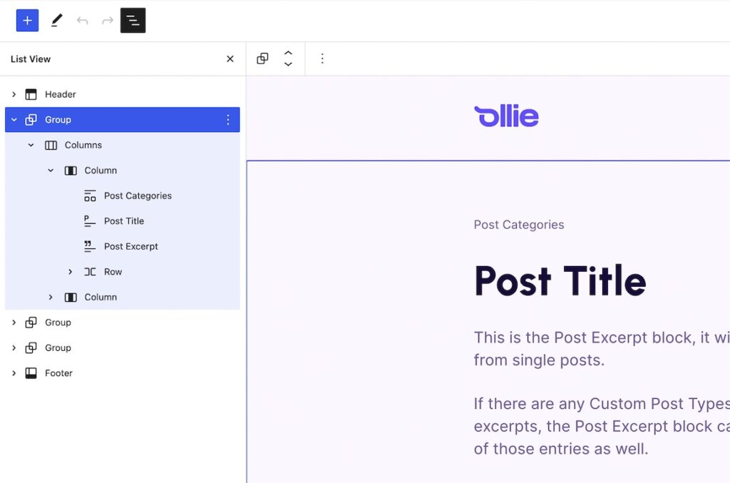
The block list view shows you a visual hierarchy list of the blocks on the page, which makes selecting and editing blocks much easier. This is very similar to list views you see in apps like Photoshop or Figma, where you use a list view to traverse and edit layers, group objects together, and make bulk changes.
You can access the block list view by clicking the list view icon in the top right of the editor header, but if you want to become a block editing pro, consider learning the keyboard shortcut!
If you’re on Mac, the shortcut is Option + Control + O and if you’re on Windows the shortcut is Shift + Alt + O. This shortcut will toggle the list view open and closed.
Pro Tip: You can easily group blocks together in the block list view by selecting multiple adjacent blocks and clicking Group in the kebab menu on any of the selected blocks.
Block breadcrumb links
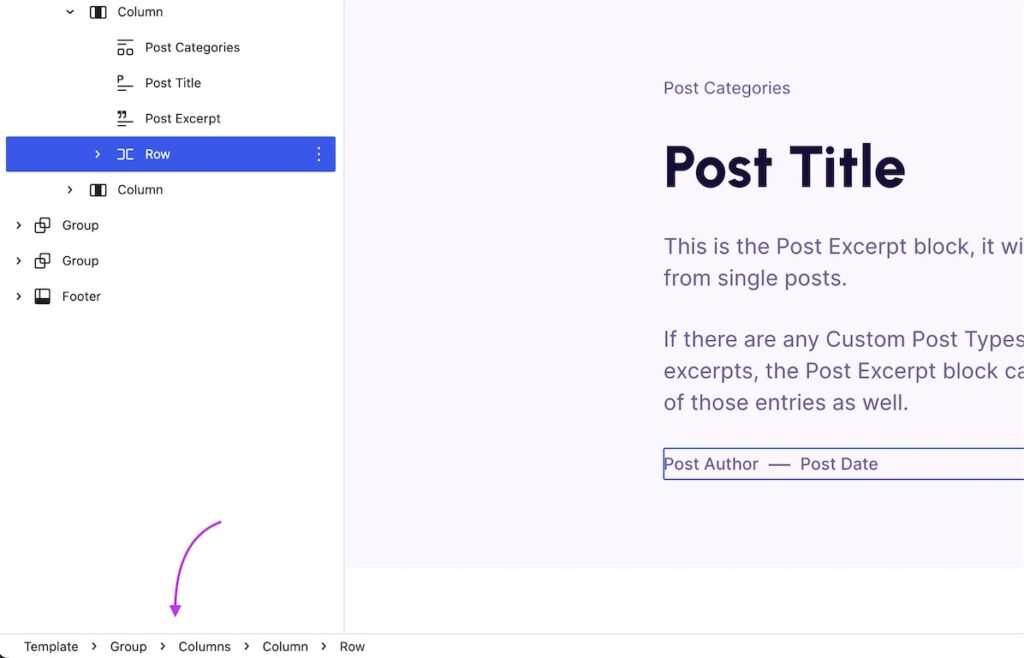
There’s also another way to quickly navigate through the hierarchy of blocks. On the bottom left hand corner of the editor window, you’ll see breadcrumb links that lead to your block.
Template › Header › Group › Post Title
Clicking the breadcrumb links will jump to that block and select it for you. This is really handy if you have a complex layout with nested blocks, where selecting a specific parent block can be tough.
If you can’t see the breadcrumbs, go to the Options kebab menu in the upper right hand corner of the editor and then go to Preferences › Appearance to enable them.
3. Modify blocks via keyboard
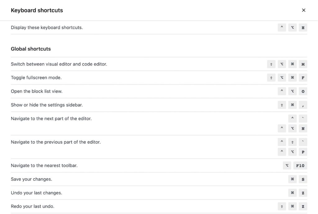
When building a page, or even just writing a blog post, you’re going to be adding blocks and rearranging them quite often. Thankfully, there are a bunch of keyboard shortcuts to help you modify and move blocks around.
You can find the full list of keyboard shortcuts with the following shortcut.
- Mac:
Control + Option + H - Windows:
Shift + Alt + H
Copy, Paste, and Save
For starters, all of the common keyboard shortcuts you use throughout the day will work in the block editor. Saving, copying, pasting, underlining, bolding, creating a link, undoing actions, redoing actions — these all work! Just use the same keyboard shortcut you use in other apps.
Duplicate current block
Duplicating blocks can save you time when creating new columns or recreating a design you’ve already created elsewhere.
- Mac:
Shift + Command + D - Windows:
Ctrl + Shift + D
Remove current block
Deleting blocks can be done with the Options menu, but you can do it quicker with the following shortcut!
- Mac:
Control + Option + Z - Windows:
Shift + Alt + Z
Insert before or after
When designing layouts, it can often be helpful to insert design elements before or after existing patterns. The following shortcuts will add a new block entry before or after the selected block.
Insert a new block before the selected block:
- Mac:
Option + Command + T - Windows:
Control + Alt + T
Insert a new block after the selected block:
- Mac:
Option + Command + Y - Windows:
Control + Alt + Y
In this shortcut, T and Y are next to each other on the keyboard, which makes it easy to remember.
4. Block editor Options menu
Although there is no shortcut for the editor Options menu, you should become familiar with it because there’s a lot jammed in there! You can open up the Options menu by clicking the kebab icon in the upper right hand corner of the screen.
Here, you’ll find quick access to the different views for the editor (top toolbar, spotlight mode, and fullscreen mode), a toggle between the visual editor and code editor, tools, and a link to the Preferences window.
The Preferences window helps you customize the editor experience and tailor it to your workflow. You can customize the user interface, removing unwanted elements, enable and disable specific blocks, and choose what displays in the panel at the bottom of the editor.
Pro Tip: If a plugin or theme you’ve recently installed is adding unwanted noise to the editor, check the Preferences menu to see if there’s a way to turn it off.
5. Navigate your content with the Document Outline
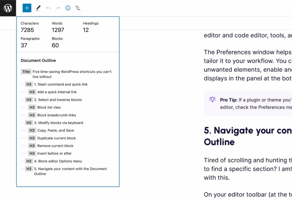
Tired of scrolling and hunting through your posts and pages when trying to find a specific section? I am! Fortunately, there is a handy menu to help with this.
On your editor toolbar (at the top of your post or page edit screen, there is a Details menu (look for the ⓘ icon next to List View). When toggled open, you’ll see some helpful details about your content, such as the number of characters, words, headings, etc.
Below that info, you’ll find your Document Outline. This list shows the hierarchy of your content based on the headings in your post or page. That’s great and all, but the really cool part is that you can click the headings to quickly jump to that section of the page. Think of it as a content navigation menu!
Wrapping up
I know it can be hard to adopt new shortcuts into your workflow, but I encourage you to try a few of these out, especially the shortcuts that help you add content quickly since you’ll do that most often.
The WordPress editor is all grown up now, and finally has the powerful site and content building tools we’ve always wanted! This means you can build better websites much faster than before, and with these shortcuts, you can save even more time and money along the way.
If you liked this post, consider subscribing to the newsletter below and I’ll send you handy tips like this right to your inbox. 😎



Leave a Reply