In pursuit of a more intuitive onboarding experience

With Ollie patterns, we’re able to help you apply a pre-designed homepage super quickly, but there are still a bunch of steps you have to do before you get to that point. Let’s explore some solutions.

Pattern, Abstract, Modern, Curves, Shapes, Solid, Composition, Minimal, Petals

Over here at Ollie HQ, we’re working our way towards a public release of the popular Ollie block theme. The theme will remain free, of course, and will be available to download from the WordPress.org repository. This means you’ll be able to install and update the theme directly from your WordPress install!

In preparation to the public release, we’re making some changes in the theme that you may want to know about ahead of time.

Experimenting with homepage templates

Getting your site set up and ready to launch can be a monumental task. And your homepage is one of the most important parts of your website, so you tend to spend a lot of time there.

With Ollie patterns, we’re able to help you apply a pre-designed homepage super quickly, but there are still a bunch of steps you have to do before you get to that point. So we’ve been spending a lot of time figuring out how to best tackle the homepage setup so you can get to design and customization a lot quicker.
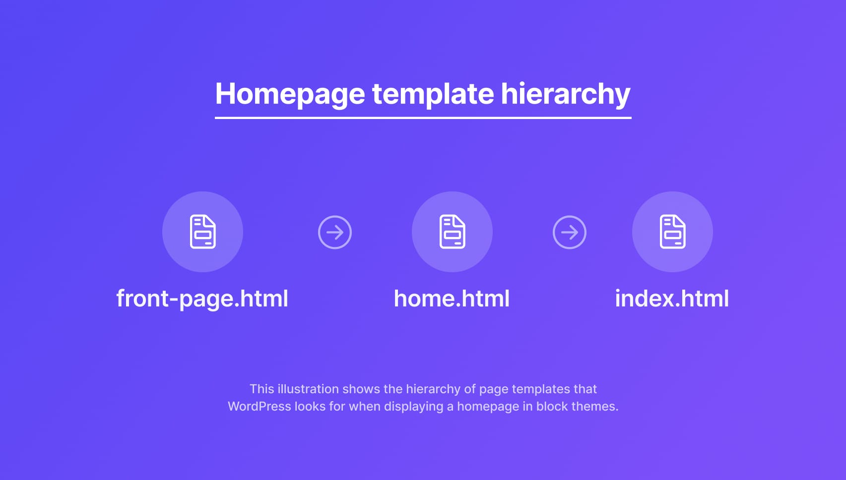
Early on, I was experimenting with using the front-page.html and home.html templates in the Ollie block theme. These templates all work slightly differently, but basically, they handle how the homepage is displayed.

If I include these in a theme, WordPress will load these templates automatically on the homepage for me. It basically forces your site to use the design supplied by the template. In the case of block themes, users can start modifying the homepage design without having to create and set up a homepage themselves.

Because of that brute-forced homepage design, it allows you to have an impressive demo of your theme on WordPress.org. Because they don’t let you create your own demo there, it defaults to a not-so-impressive default view of sparse blog posts. As a result, users can’t immediately see the best version of your theme hosted on WordPress.org.
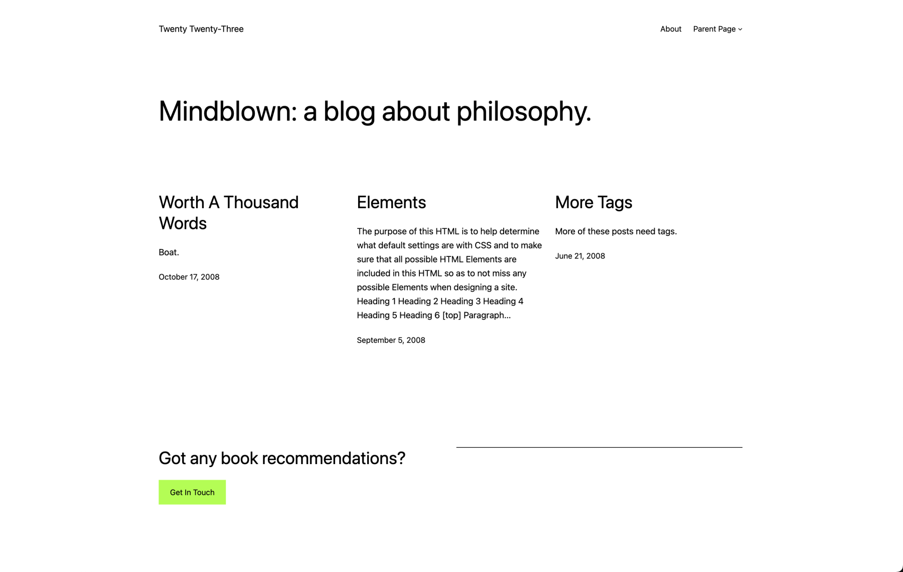
The theme demos on WordPress.org leave a lot to be desired.

But with the front-page.html and home.html templates, you can force the theme to show a better design, and many block themes on the repo have started to go this route.

Now, don’t get me wrong, both of these templates are still useful in certain circumstances, particularly in client work where you often need to be crafty to solve the many diverse homepage needs you encounter.

However, if you are distributing a theme for public use, there are some unfriendly consequences you may want to consider.

Breaking expectations

Unfortunately, both of these templates also come with drawbacks. Most annoyingly, it breaks the long-standing behavior of the homepage and blog settings in Settings → Reading in the WordPress admin.

If you use the front-page.html template, you can’t set a custom homepage. You have to use and modify the content provided in the front-page.html template. Lots of folks like to set custom homepages, so this won’t work. 🙃

If you use the home.html template, you can set a custom homepage, but you can’t set a custom blog page. Instead, it will default to use home.html. Lots of folks like to set custom blog pages, so this won’t work. 🙃

Neither of these are ideal, and both of them caused users a lot of confusion in the short time I was experimenting with them. This is not something I could release on WordPress.org to a wide audience.

Instead, I just got rid of both templates and went back to the old way of doing things. Users can now dictate whatever pages they want for the homepage and the blog, and we’ll just help them create a beautiful homepage by other means. On that note…

Ollie onboarding is on the way

Hacking the theme to get an aesthetic outcome for WordPress.org (or otherwise) isn’t the answer here. Ultimately, it’s a bit of a self-serving hack that breaks longstanding expectations and user behaviors. It solves one problem for creators while introducing a handful more for users.

So instead of going down that road, I decided to invest the time and effort into a more robust onboarding experience that can solve more than just the longstanding homepage problem. So, a few months ago, I started working on the Ollie onboarding wizard.
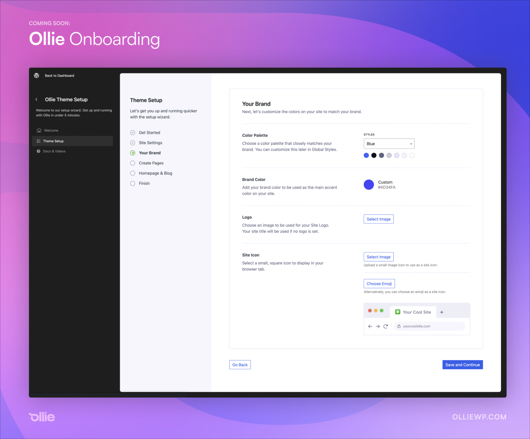
The goal of this wizard is to help WordPress users zoom through a site setup with the Ollie theme and abstract away those annoying and disconnected setup steps we have to do for every site.

Using a blazing-fast React interface, designed in the style of the WordPress site editor, we can cut down the time it takes to set up a site to just a few minutes.

Instead of jumping around the admin, creating pages manually, applying designs with patterns, and then assigning those pages in the WordPress settings, we can just do that for you in two steps. 😍

The wizard is also a way to educate users along the way. WordPress is going through a much-needed evolution, but as expected, users are having a tough time with the transition. Change is tough, especially when you power half of the internet.

Helper layers like the Ollie onboarding wizard can help ease the transition into block theme building and promote a more efficient site building experience. In pursuit of that, our goal with Ollie is to build features and interfaces that feel effortless and inevitable. This is just the start!

Wrapping up

We’ve just released version 0.1.4 of Ollie on Github with some changes in support of the upcoming onboarding wizard and public release. Check out the full release notes below, and download the theme and related files on Github.
28 responses to “In pursuit of a more intuitive onboarding experience”

  1. Jason Schuller Avatar
    Jason Schuller

    Absolute 🔥

  2. Ren2049 Avatar
    Ren2049

    This looks great, looking forward to try the new version. A good onboarding flow is long overdue in WP.

    Why don’t they hire you, Mike, put you in charge of the default theme where Ollie becomes the new rolling release default? Seriously, core WP is really lucky to have you, Brian Gardner and Nick Diego on their side.

    That’s why I still have hope that through themes and ideas from you and the other mentioned will somehow cause a breakthrough for the block editor.

    Designers who don’t build themes from scratch inside the block editor have no clue how hard it really is to wrestle with its current limitations, so themes from design savvy devs where I don’t have to reverse most of the defaults and can build on top of a good foundation are a huge relief.

    1. Jake Hawkes Avatar

      I just want to second what Ren2049 has said, and add a h to the ella cool!

    2. Andrei Chira Avatar

      I agree, an onboarding flow should be built in the core WP. It would be extremely helpful to many users.

      1. Mike McAlister Avatar

        I’m having conversations with folks on how to bring more components and design patterns to the developer experience. We discussed how patterns like onboarding and pro/upgrade screens could look. 👀

    3. Mike McAlister Avatar

      Maybe someday I’ll work on a default theme! It’s a lot of work, that’s for sure. But it would be super cool to design one of those, and there’s no better time than now to try something different.

  3. Marc Avatar
    Marc

    WordPress needs a built in header builder and a footer builder. Also the FSE navigation is such a mess. Consistent buttons throughout the entire site seem to elude me as well.

    1. Mike McAlister Avatar

      It pretty much does have a dedicated header and footer builder with template parts! Those are dedicated sections that you can build visually and update globally.

  4. Michel Avatar
    Michel

    Agree with Ren2049, Mike is one of the most talented guy in the block theme area.

    We already have Justin Tadlock, Nick Diego and Rich Tabor who are very skilled people. As he have wonderful ideas, Mike could be part of this dream team. And he can bring his strong skills in term of UX/UI for block themes and Gutenberg.

    1. Mike McAlister Avatar

      Too kind, Michel! I’m in good company with that list of names, that’s for sure.

  5. Dragos Avatar

    It is looking very good. I can’t wIth to start creating some tutorials.

    1. Mike McAlister Avatar

      That would be awesome, Dragos! I look forward to releasing soon!

  6. Steven Gliebe Avatar
    Steven Gliebe

    Really nice, Mike!

    1. Mike McAlister Avatar

      Thanks, Steven! You are a long-time follower of my work and I thank you for it! 😎

  7. Charles Lambert Avatar
    Charles Lambert

    Excellent initiative, Mike. I am still struggling to get my head around the vagaries of home.(html|php) and front-page.(html|php), when they’ll appear and when they won’t. Can you point to an article that explains this coherently?

    1. Mike McAlister Avatar

      Hey Charles, this actually has a pretty good breakdown of the nuance between the two.

  8. Patty Avatar

    Thanks Mike, I have Ollie installed on a test site. My goal is to switch from the theme I have activated to Ollie. Will the new onboarding setup be helpful in this situation with a site already established?

    1. Mike McAlister Avatar

      Hey there, the setup wizard is best used on a new site, but you certainly could use it for changing brand settings, color palettes, etc. You could even use it to generate pages with patterns if you want. Worth it to give it a try!

  9. Grant Furley Avatar
    Grant Furley

    Hi Mike. Love Ollie – thanks for your work on this, much appreciated. A few questions /thoughts for you. This could be a bit too much for a post comment, but here goes anyway:
    – Front-Page. I like to think of home and blog pages as legacy options, and front-page as the landing page for a modern Gutenberg site. It’s already overriding the others. I’d like to see WP make it clear that this is the default for block themes, which would end years of confusion between all these options. This could be the way you use it in Ollie too, if you agree?
    – Front-page template. There can only ever be one unique front-page. So we don’t need a template for it – it would be much simpler to just design in the editor using the standard page template. Having the option of a specific front-page template is unnecessary. Do you agree this could work?
    – Themes and onboarding. I’d like to suggest that you treat the onboarding wizard (and any similar functionality) as a plug-in, not part of the theme. Please let me explain – it seems to me that the whole concept of themes in WordPress is needlessly confusing. Is a theme a design template (setting up fonts, colours and layout), a starter site (with premade structure and placeholder content for a particular use case), or functionality fix (adding extra functionality to WordPress that makes it easier to use or more powerful). Or all of the above? Obviously there are examples of all types in the theme library, which is why users can easily get confused. In my view it’s time for WordPress to make themes easier to understand and use in this world of blocks and patterns. And Ollie could take the first step through the way you operate.
    I suggest that the term “theme” is restricted to designs and related general purpose patterns, and that the term “starter kit” or similar be adopted for sets of patterns that include navigation, structure and dummy content for particular use-cases (eg portfolio, blog, charity etc). Functional changes would not be included in themes, instead only available as plugins.
    Taking this approach Ollie seems to me to be a pure design “theme” with general purpose patterns. It could easily be used with any “starter kit” (if for example someone wants to fast track their portfolio site) or on it’s own for those wanting to set a site up from scratch. Any additional functionality (such as your planned streamlined onboarding experience) could be available as a “plug-in” for any theme or site kit. You could recommend or offer it with your “theme”, but then anybody with another design theme (such as TwentyTwentyThree) could use it too.
    Splitting these parts into the three areas, rather than bundling them together makes it much easier for users to find and choose the best option for their needs. And for people like you, Ollie could be used with any combination of starter kits and /or plugins, thus widening your potential market. You could also develop a market of “starter kits” that leverage your “theme”.
    This line of thought is probably a bit radical for some, but it seems to me it’s time to find a way out the current mess. Some variation of this idea could succeed with the support of people like you. What do you think?

    1. Mike McAlister Avatar

      Hey Grant, thanks for your comment! I believe we talked a bit on YouTube about some of this. In my opinion, there’s room for rethinking the theme/plugin separation and how it can contribute to a disjointed experience. We’ll see how it goes with the Ollie wizard! Folks really seem to love it so far.

      As far as the Front Page template, I definitely agree on that. In general, I don’t think distributed themes should rely on this as it breaks the user experience and fixing it isn’t intuitive. Instead, the content should exist in a page and then get assigned to the homepage.

      Thanks again for your really thoughtful comment!

  10. Paul Avatar
    Paul

    Hi Mike,

    Love this.

    Download Ollie Theme v1 and install and activated.
    When I click on appearance Ollie I just get a blank black screen and the wizard does not load.
    Any suggestions, please?

    Thanks

    Paul

    1. Mike McAlister Avatar

      Hey Paul, you’ll want to grab the latest version of the theme on GitHub (soon on WP.org). This issue has been fixed!

  11. Arkadiusz Avatar

    Just this morning I couldn’t wait for Ollie to appear on WordPress.org, but after your post on Twitter today. I don’t care if Ollie is on .org. I want to buy the PRO version!

    1. Mike McAlister Avatar

      Thanks buddy! We’ll see where this goes, but rest assured, Ollie pro is going to be crazy good. 😎

  12. Abdus Fauzi Avatar

    Great implementation!

    Sorry to know the issues that are pending with WordPress.org theme repository. Hope things will get settled soon.

    All the best 🔥

    1. Mike McAlister Avatar

      Thanks Abdus, we’re making progress! We should have some answers next week!

  13. David Cooper Avatar
    David Cooper

    Hi, I’ve just started using Ollie and I’m loving it so far. One quick question – well 2 actually 🙂 Firstly, what’s the best way to add extra fonts, esp. Google Fonts. Secondly, is this blog this best way at the moment for asking questions such as this? Thanks.

    1. Mike McAlister Avatar

      Hi David! Thanks for checking out Ollie. Right now, it’s not super intuitive to add new fonts. However, the new font library is coming to WordPress core very soon (in 6.4 in November). In the mean time, there is a plugin called Create Block Theme that will help you add new fonts.

      The best way to ask questions right now is to ask on Github. You can open an issue or open a feedback ticket and we’ll be happy to help out! Eventually, we’ll probably add a ticket system, but for now GitHub is a good place to start.

Leave a Reply

Your email address will not be published. Required fields are marked *