When we launched Ollie Pro in early July, my partner Patrick and I weren’t sure what to expect. Even though the WordPress block editor has been around since 2018, oddly, it still feels like very early days for products in the modern WordPress economy.
It’s been reported that WordPress block themes and full-site editing adoption is still feels quite slow. And despite the many improvements that have gone into the software over the past few major releases (it really is shaping up nicely in many spots), there is still an ever-present tension between the modern WordPress experience and users and developers who use the software every day.
Despite these growing pains, the new paradigm of building your site with native WordPress using the site editor, patterns, styles, and templates has continued to gain an optimistic fanbase.

There is something palpably exciting and refreshing about building websites visually with a drag-and-drop editor inside WordPress. It’s the main reason many builders have ultimately left WordPress over the years for more modern, sleeker, and tailored website building solutions like Webflow, Wix, Framer, etc.
But what I’ve been hearing in pre-sale questions and chats with Ollie Pro customers is that the prospect of a unified and intuitive WordPress site building experience — one that lets us leave behind the fragmented experience of hopping from page builder to page builder — is something many are pining for.
These people don’t want to leave WordPress, but they also need WordPress to meet them half way with enough tooling that they can build professional, client-ready websites with the core experience. And although it’s still not there for some, we’re starting to see the transition take place.
Finding a pattern
Despite the headwinds, there have been features in the software that have solidified and found widespread appeal. One of those features is WordPress patterns. And that’s where we decided to place our bets with Ollie and Ollie Pro.
WordPress patterns have revolutionized how we build and customize websites by providing pre-designed layouts that can be easily inserted and adapted to your content. These patterns, especially those found in Ollie, are a game-changer for anyone looking to speed up their design process without sacrificing quality.
WordPress Patterns
The initial launch of Ollie Pro is all about WordPress patterns.
Although patterns are super powerful, they can be tedious to build while ensuring they look great on all devices. That’s where Ollie and Ollie Pro come in.
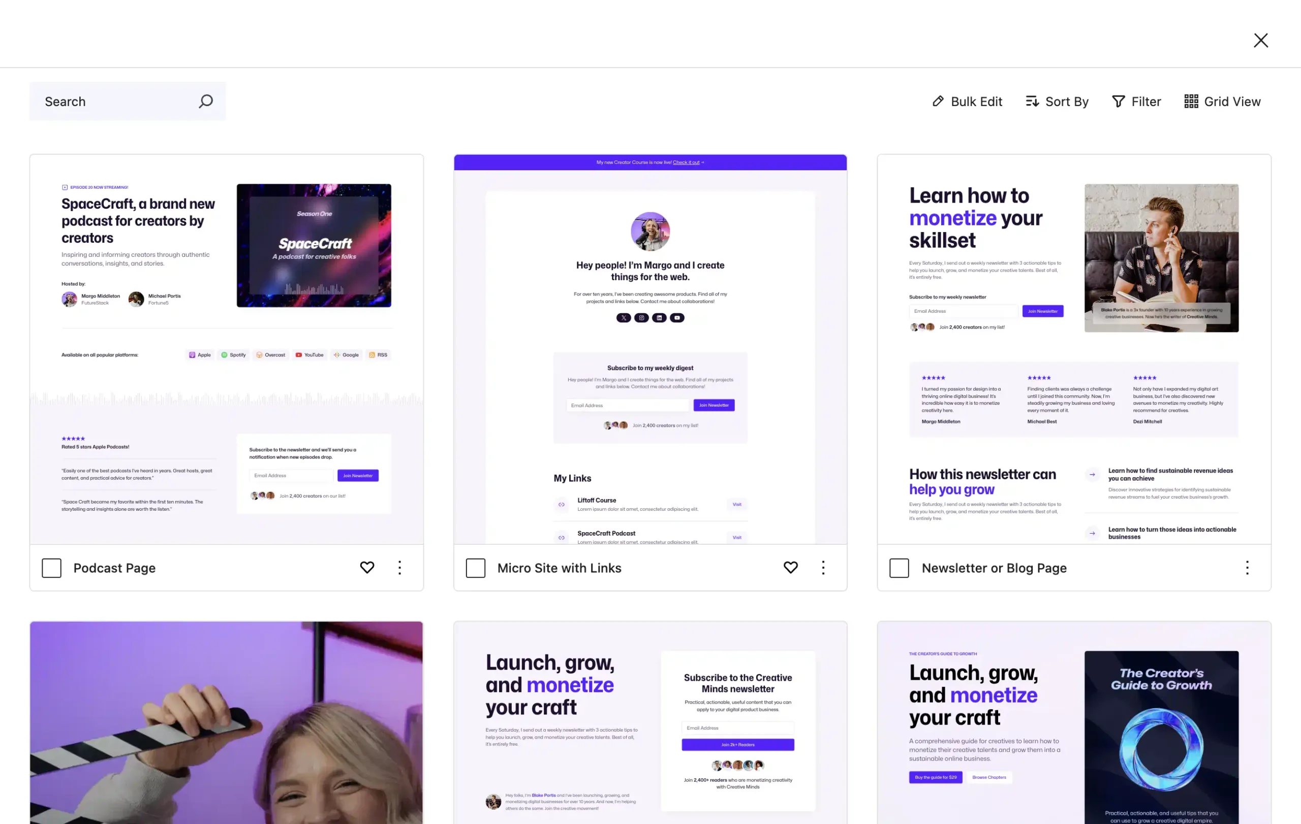
We’ve created an entire library of stunning, responsive patterns that help you design better, build faster, and publish sooner. And we’ve built an intuitive experience around it to make designing professional websites as painless as possible.
You can preview the Ollie Pro pattern library on the Ollie Pro landing page.
The first 30 days
So far, our intuition to invest in patterns and modern WordPress has paid off. Within our first month, we’ve hit $10,000 in subscriptions for Ollie Pro, far exceeding our own expectations. 🎉

This is a great foundation to build upon. Not only does it give us a little capital to start playing with, but it also gives us our first 100 customers to help shape the product, iron out bugs, and start dialing in the messaging and marketing.
Priced to sell
One of the first bits of constructive feedback we were seeing from customers was about our pricing. We initially launched with two pricing options:
- Activate Ollie Pro on one site for $69/yr
- Activate Ollie Pro on 10 sites for $249/yr
From the outset, we knew this wasn’t an ideal pricing structure, but we wanted to let the users tell us how to improve it. We knew roughly where we wanted our lowest and highest price points but it wasn’t clear how users would want to implement Ollie Pro.
Within the first few days, the feedback was resoundingly consistent: users wanted an agency plan with flexibility to grow with many site activations.
The fix was easy enough. We made our $249 plan the Agency plan, and increased the number of site activations to from 10 to 500. We also introduced a Freelancer plan for $129 with 5 sites. The Creator plan remained the same, $69 for one site activation.
- Activate Ollie Pro on one site for $69/yr
- Activate Ollie Pro on 5 sites for $129/yr
- Activate Ollie Pro on 500 sites for $249/yr
These changes were met with widespread approval! The Agency plan started gaining traction immediately, and people also started buying the new Freelancer plan. This tells us we’ve hit a nice balance and that the plans all have a persona that they appeal to.
The need for speed
I recently wrote a post detailing a very important and valuable performance improvement we made in our first few weeks.
In short, we changed the way we were showing patterns in the Ollie Pro pattern library. We switched from iframe previews to image previews, which dramatically improved the overall performance of the library. Now it’s blazing fast, and there’s still more we can do to make it even faster.
It’s not for everyone, yet
Ollie Pro has a 14-day, no-questions-asked refund policy. This let’s customers take the whole experience for a spin and figure out if it fits their workflow.
While we’ve had about a dozen refund requests, everyone has been really positive and constructive about it. The feedback is almost always some version of this:
We love Ollie and what you’re building. But WordPress just isn’t where I need it to be to build the kind of sites I build for clients. We look forward to trying Ollie again when WordPress catches up.
Our decision to build a premium product alongside the native WordPress experience means our success is directly tied to the day-to-day success of the software itself. If users are having a hard time with the block editor or site editor UI, they are having a hard time with our product.
That means we have a vested interest in making sure this experience continues to improve with every release. We do that by staying active in conversations, contributing, passing feedback up the chain, and more.
Navigating navigation
The most common complaints we get from users are around the navigation block and the lack of responsive controls.
The complaints about the navigation block are widespread in the community. To put it simply, it’s just not a great experience. It’s both overly-simplistic and overly-complicated at the same time. And currently, there is very limited customization for how the mobile menu looks and behaves (though there are proposals and prototypes to improve this).
In real-world websites, mobile menus are an incredibly important part of the website. When you’re building client sites, it’s a huge focus for the client, as it should be. They often aren’t just folded down menus of the header navigation — they usually require extra consideration.
Users want more control
Responsive controls is also something that has been widely requested by WordPress builders, but it’s still unclear if/when core will implement them. There is some movement on the issue here and here.
Again, it’s not that the site editor and fluid design can’t get you really close — it can. But WordPress competitors don’t settle for “close,” and neither should we.
To many, it feels like we’re only solving part of the problem, or that full-site editing is only meant to build a particular kind of site (a simple one). We’re saying “WordPress is a no-code tool!” and also “You need to switch to custom CSS to fix your edge cases.”
I’ve made my thoughts on responsive controls clear. And based on the latest discussions, if we do get controls in core, it looks like this kind of context-specific approach will be similar to my proposal.
The sooner we signal that this is coming to WordPres, the more likely we are to improve adoption of full-site editing tools. It’s a feature requested by everyone from beginners to advanced users.
Observations
Even as a successful WordPress product owner in the past, I’ll be honest, it’s been tough building a business in this new era of WordPress.
- It’s been hard to know if the software is stable enough to support a core-adjacent business model around this new paradigm.
- It’s been hard to zero in on an audience because of how polarized the community is.
- It’s been hard to speculate on where the software is going and how to build toward it.
We’ve only been live for 30 days, so these are just some quick observations, but there are some interesting implications at work here.
It’s going to be quiet for a while
I don’t think we’re going to see as many WordPress products going forward. The barrier to entry is much higher now with JavaScript being the driving force of modern WordPress development.
We simply haven’t seen a renaissance of WordPress development. Instead, users are looking for ways to bypass the complexity and the result is products and solutions that are only scratching the surface of what is possible in WordPress now.
Waiting for product leadership
It’s clear that people are interested and curious to start building with modern WordPress, patterns, styles, and full-site editing. At the same time, they don’t know where to start.
Users, developers, and product creators are looking for leadership on how to proceed in this new era. That’s part of the reason Ollie is succeeding. We’re providing a clear pathway to get started with a block theme and educational resources like docs, videos, and a Slack community. And now, we have a Pro offering.
To date, Ollie is one of the most coherent products to come out of the modern WordPress space — and that’s no coincidence. Patrick and I spent an incredible amount of time focusing on the Ollie experience to set it aside from the fragmented alternatives that are currently out there.
Any product that wants to succeed in this new WordPress economy will have to do the same. We’ve entered a more sophisticated product era where users demand and deserve a better user experience.
Looking ahead
Ollie’s early adopters have been incredibly valuable in helping us figure out the next steps for our product. In the short term, we’re going to stay focused on smoothing out the user experience and nailing our baseline features in the pattern library.
Users have expressed interest in seeing more styles, more patterns, and more intuitive block theme tools to help them spin up sites quicker.
We’ll also be revising the Ollie Pro setup wizard to rework that around the Ollie Pro experience. The wizard was initially created to service the free Ollie block theme, but now we’ve got so many more features at our fingertips that we can use to shape an incredible new setup experience.
Get Ollie Pro today!
We’re super excited about Ollie Pro and being one of the leaders in this new WordPress product space, and we hope you’ll try out this new site building experience.
But we’re also excited about what Ollie Pro represents for the future of WordPress site building. The future of WordPress is bright and the possibilities are only just beginning to show. The most popular website building platform on the planet just keeps getting better, and we’re here to leave our mark on it.


Leave a Reply