We are truly in a renaissance of web design and development resources right now. We’ve got abundant content, design and dev tools, pre-made assets like templates, icons, and fonts, and dozens of platforms to bring it all together (thanks, WordPress!).
Typography for the web is also at its height. We’ve seen some incredible gains in typography, in both availability of new fonts and performance improvements. With full-site editing, WordPress is also making it a lot easier to work with typography.
🧵 Check out what’s new inside WordPress 6.7…
However, with all the new fonts flooding the ecosystem, it can be hard to find the gems. No worries! Starting today, I’ll be publishing a regular series of font recommendations to help you jazz up your WordPress (and non-WordPress) websites.
Let’s take a look at some absolutely fire fonts! 🔥
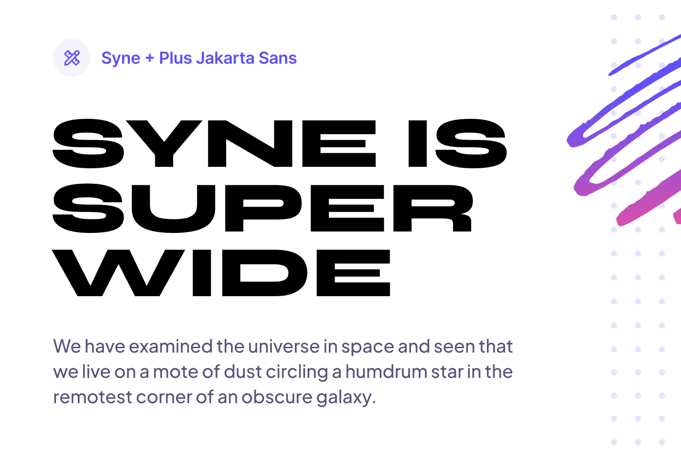
Syne and Plus Jakarta Sans

Let’s start things off with a wildly-unique sans-serif called Syne. At its lighter weights, Syne looks like a fairly standard sans-serif font. However, as you increase the weight up to bold and extra bold, the font becomes super wide and makes for a truly distinct headline font.
Paired with a sans-serif body font like Plus Jakarta Sans, you get a clean and modern pair that perfectly compliment each other’s geometry.
- Headings: Syne via Google Fonts
- Paragraph: Plus Jakarta Sans via Google Fonts
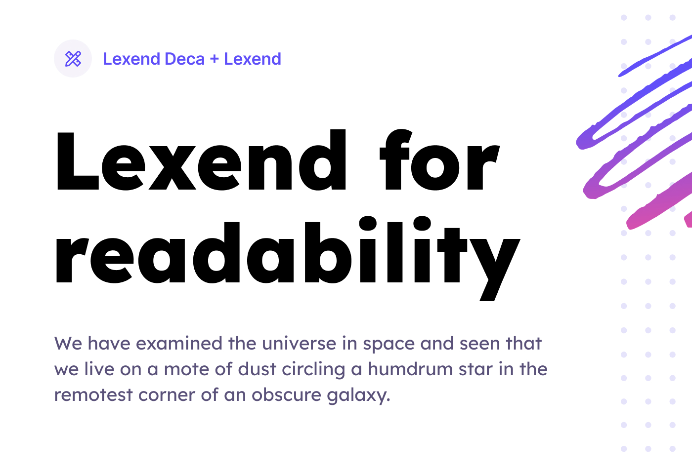
Lexend Deca and Lexend

Lexend is a font designed to solve a problem. This font is specifically designed to reduce visual stress to improve reading performance. Initially designed with dyslexia and struggling readers in mind, Bonnie Shaver-Troup, creator of the Lexend project, soon found out that these fonts are also great for everyone else.
The Lexend family is extensive, ranging from a standard width font as seen above, to a very wide variation with Lexend Zetta.
- Headings: Lexend Deca via Google Fonts
- Paragraph: Lexend via Google Fonts
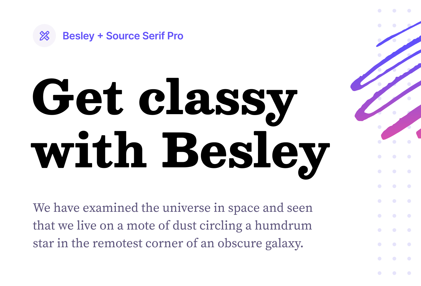
Besley and Source Serif Pro

As much as I love my sans-serifs, I can’t leave out a good ol’ fashioned serif font. Today, I’m recommending you check out Besley. You can see from the image above that Besley has a punchy and distinct personality. It’s bold, classy, and playful all in one beautiful package.
I’ve paired it with Source Serif Pro to compliment the serif, but with a slightly lighter appearance without compromising readability.
- Headings: Besley via Google Fonts
- Paragraph: Source Serif Pro via Google Fonts
Wrapping up
Today, we’ve been digging into Google Fonts, but there are a bunch of great font resources out there that we’ll dig into next time. Until then, I hope you found these recommendations helpful, and I can’t wait to see how you put them to use!
If you liked this post, be sure to subscribe to the newsletter below, where I share articles like this, but also a regular email-only digest of the latest happenings in the WordPress space.


