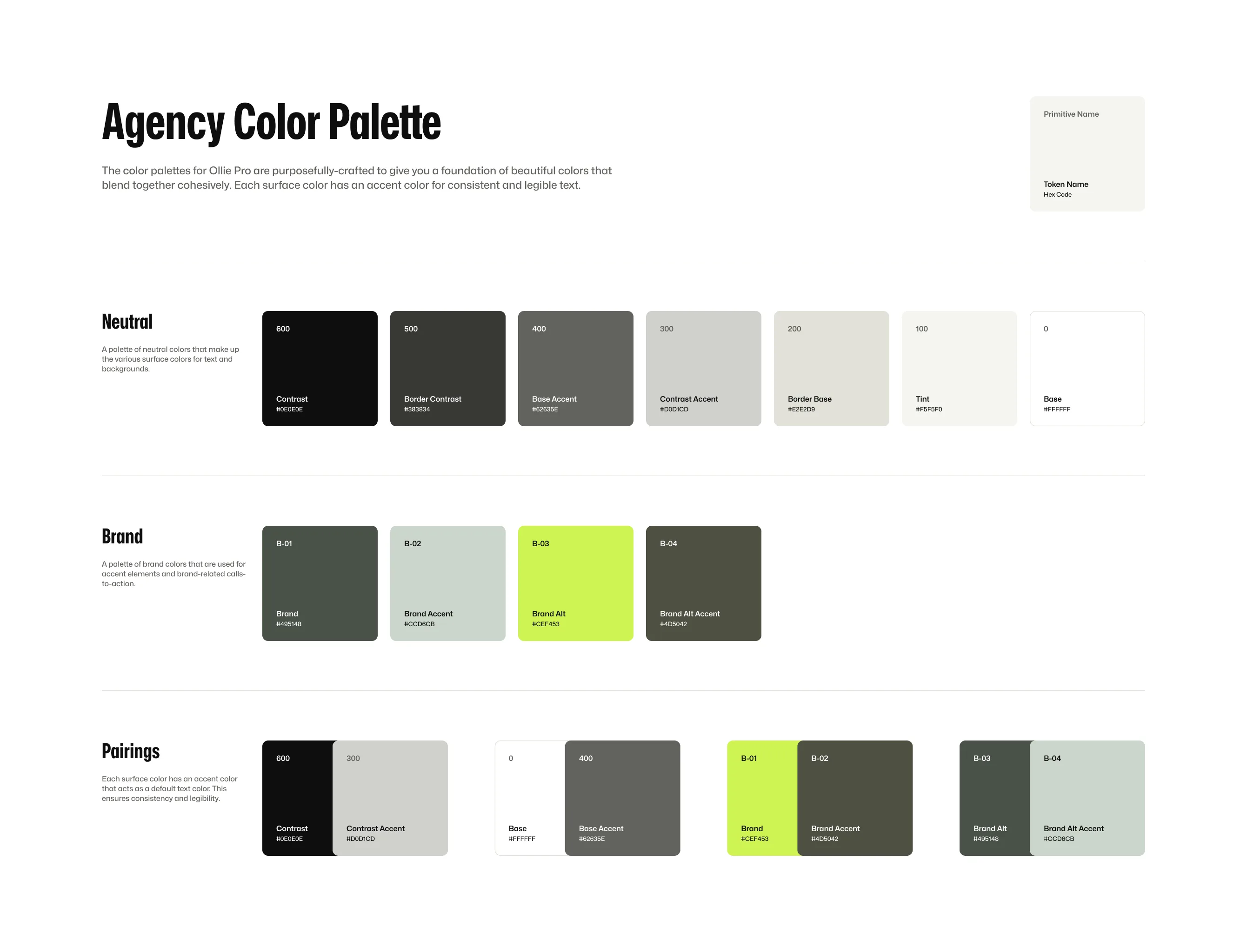
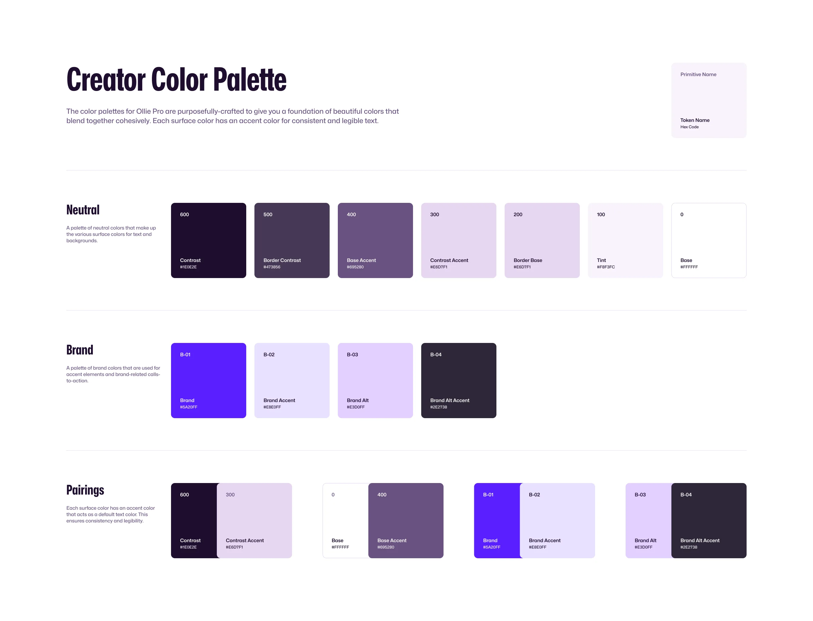
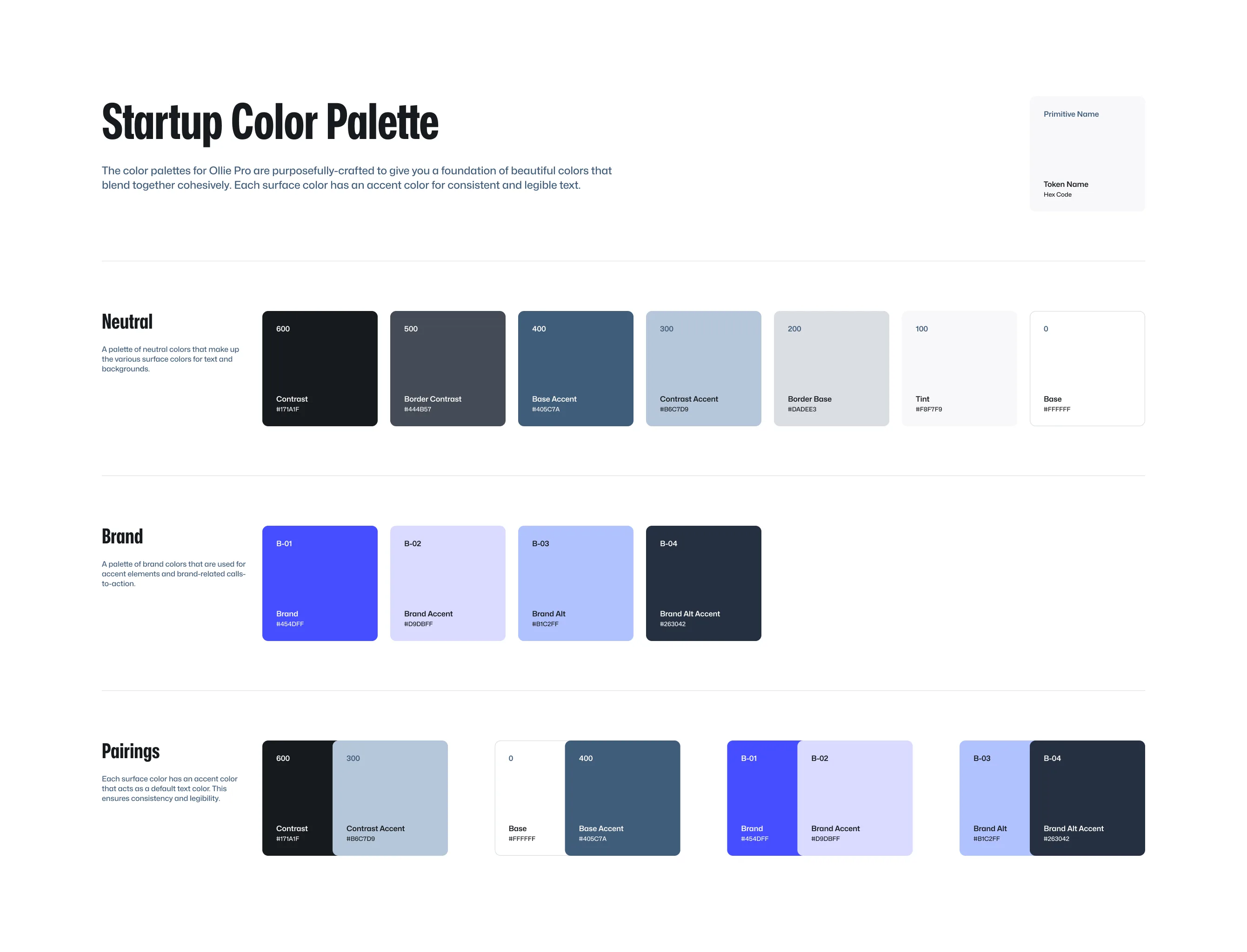
The power of WordPress’s full-site editing paradigm is that it gives you the power to create a powerful, yet practical, design system on your site.
Design systems help us maintain design consistency across our sites with predictable colors, typography, spacing, and other design elements.
By leaning into this system and using the tools to our advantage, we can build cohesive and easily manageable websites that can scale with our needs.
Ollie’s color system
Ollie ships with a purpose-built color system that makes it easy to create beautiful, cohesive designs without being a color theory expert.
Every color in Ollie’s palette was carefully curated to work harmoniously together while giving you the creative freedom to express your brand’s unique personality. And because everything is connected through WordPress’s global styles, updating your site’s color scheme is as simple as a few clicks.
Color Palette Slots
Ollie’s color palette consists of 11 slots, each serving a specific purpose in the overall Ollie design system and pattern collection. Think of each color in the design system as having a specific job to do.
Let’s take a look at the color palette slots below to get a feel for the naming convention and then we’ll explore the system in detail.
Color Name
Color Slug
Hex Color
Brand
primary
#5344F4
Brand Accent
primary-accent
#DDDAFB
Brand Alt
primary-alt
#DEC9FF
Brand Alt Accent
primary-alt-accent
#575094
Contrast
main
#1E1E26
Contrast Accent
main-accent
#D4D4EC
Base
base
#FFFFFF
Base Accent
secondary
#5F5F82
Tint
tertiary
#F8F7FC
Border Base
border-light
#E3E3F0
Border Contrast
border-dark
#4E4E60
Heads up: Developers may notice there is a temporary mismatch between the color name and color slug. Slugs will eventually be migrated to maintain consistency with the names.
Accent Colors
As seen in the table above, Ollie ships with four slots for your brand colors, and seven slots for text, backgrounds, and UI elements. Combined, you can create a beautiful and consistent color system for your site.
Each main color in the system has an “Accent” partner color. These color pairs are designed to work together in two ways:
- You can use the main color as the background with its accent color as the text
- You can flip them – using the accent as the background and the main color as the text
Both combinations will maintain good readability and contrast and give you a lot of options when creating unique designs in your layouts.
Brand Colors
Brand colors are most commonly used for buttons, call-to-action sections, and other elements that need to draw user attention and maintain consistent brand identity across the interface.
Ollie provides four slots for your brand colors: Brand, Brand Accent, Brand Alt, and Brand Alt Accent.
Brand
#5344F4
Brand Accent
#DDDAFB
Brand Alt
#DEC9FF
Brand Alt Accent
#575094
Brand and Brand Alt are dedicated to your two main brand colors. And Brand Accent and Brant Alt Accent are dedicated to accent colors that work as accented text on those colors.
The idea here is to create background and text color pairings that always go together. If we stick to our system, we know that Brand Accent is always a suitable text color to use on a section with the Brand background color.
Let’s use the following card designs to illustrate these color pairings.
Pixel perfect design
Ollie ensures your entire design scales down gracefully automagically.
Blazing fast websites
Ollie is super lightweight and scores top marks on Google Pagespeed.
In this example, we’ve used Brand and Brand Alt as the background colors for these cards. For the text, we’ve used Base and Contrast for icon and title color and Brand Accent and Brand Alt Accent for the descriptive text.
Sure, you can always just use black and white text here, but having accented text colors that are more closely tied to your brand colors creates more visual interest with depth, texture, and character for your designs.
Neutral Colors
The remaining seven slots of the color palette are for neutral colors that make up the foundational UI elements of your site such as backgrounds, text, borders, navigations, and more.
Just like with the brand colors, these color slots serve a specific purpose in the Ollie design library and across Ollie’s many patterns.
Let’s start with the most common colors, black and white. Following WordPress core’s lead, these colors are named base and contrast.
Base
#ffffff
Base Accent
#5F5F82
Contrast
#1E1E26
Contrast Accent
#d4d4ec
Most commonly, Base is used as your default page background (a light color) and Contrast is used for your default text color (a dark color). If you have a dark mode site, you would use them inversely.
Just like with the brand colors, both Base and Contrast have an accent color pairing that always work well together. Let’s look at a few card designs to illustrate these color pairings.
Customize with clicks, not code
Add your splash of colors, pick your header, choose your favorite font — all with a few quick clicks. No coding skills required.
Read More
For the white card, we’ve used Main as the background color, Contrast for the icon and title, and Main Accent for the descriptive text. We’re also using Border Base as the border separator color, which is meant for light backgrounds.
Blazing fast websites
We obsess over performance so you don’t have to. Ollie is super lightweight and scores top marks on Google PageSpeed Insights.
Read More
For the gray card, we’ve used Tint as the background color, Main for the icon and title, and Contrast Accent for the descriptive text. We’re also using Border Base as the border separator color, which is meant for light backgrounds.
Pixel perfect design
Your website deserves to look pixel-perfect on every device. Ollie ensures your entire design scales down gracefully automagically.
Read More
For the black card, we’ve used Contrast as the background color, Main for the icon and title, and Contrast Accent for the descriptive text. We’re also using Border Contrast as the border separator color, which is meant for dark backgrounds.
Style Variations
Style variations in Ollie give you the power to instantly transform your site’s entire color palette. Think of it like switching between different pre-designed color themes. Each variation comes with its own carefully curated set of colors that work beautifully together.


When you switch from one style variation to another, all the colors throughout your site update automatically – from buttons to backgrounds to text colors. You don’t need to manually change each color; the variation handles that for you. It’s like giving your site a complete color makeover with just one click.
While the colors change, their purposes stay the same. The slots maintain their roles in your design, they just get filled with different colors from each variation’s palette. This ensures that no matter what style variation you pick, you get predictable and consistent styles across Ollie Pro’s many patterns.
Maintaining Consistency
While it’s technically possible to use colors outside their intended purpose (like using a border color for text), this can create unexpected problems down the line. Think of each color in the design system as having a specific job to do.
When you use a border color for text, you’re essentially giving that color two jobs. Later, when you want to update all your border colors, that change will also affect any text where you used the border color. This can lead to unintended design changes and make your site harder to maintain.
To keep your design predictable and maintainable, it’s best to use colors as they’re intended: text colors for text, border colors for borders, and so on. This way, when you need to make updates to your colors or layouts, you can be confident about exactly what will change.
Customizing Colors
Ollie ships with several pre-designed color palettes, but you’ll likely want to customize them a bit to match your brand.
Head to your WordPress dashboard and navigate to Appearance > Editor. Once there, open the Global Styles panel to access and modify your site’s color settings. From here, you can adjust any color in your palette to match your brand’s unique style.
Check out the global style video tutorial below to learn more about customizing styles.
Global Styles Tutorial
Quickly and easily change your site’s fonts, colors, typography and more with global styles.